
Looking for a solution to help monitor field service projects and easily understand their progress. Project progress charts may be the right tool for you. With so many variables including the moving parts and costs associated with project planning, you need to be able to see a multitude of information at a glance. Project progress charts can improve accuracy when estimating the time taken to complete a project, as well as increase clarity around project status.
Let’s take a look at the different types of project progress charts and how they might work for you depending on your business needs and the specific information you want to analyze.
What is a Project Chart?
 When you think of the word “project” what comes to mind? Maybe you’re hit with a flashback of hours spent doing homework when you were a teenager or that kitchen renovation you had planned to finish this summer. Whatever springs to mind, the essence of what a project entails is usually of a similar nature; you’ll have a varying amount of tasks to complete that accumulate into one larger project. With a project chart (sometimes referred to as a project management chart) you’re able to see many moving parts in one location, get a better idea on how best to plan the work and adjust tasks accordingly over time.
Which Charts are Used in Project Management?
When you start looking into planning and scheduling projects, researching all of the different styles of project progress charts can leave you feeling a little frazzled. Each type of chart will show information relating to tasks and scheduling in a different way, so it’s really important to choose one that’ll work for your business.
The Benefits of Using Project Management Charts
 When thinking about all of the different components that form one project, how much easier would it be to streamline that process? You spend hours trawling through multiple spreadsheets in order to find a specific task or costs, then you’ve got to think about the different employees assigned to the tasks. Naturally, there are moving parts involving multiple employees that need to be kept track of during a project. This could include additional costs as time goes on, as well as labor costs and budgeting that all need to be accounted for. Not to mention having an accurate forecasting of tasks and a project overview in one area, this means making fewer mistakes and more informed decisions.
One benefit to project monitoring charts is that they provide a visual snapshot of what’s going on with your projects. I mean let’s be honest, the notion of viewing data from an image is much more appealing than doing so with text based means. In fact, studies have found that our brains can decipher images simultaneously therefore retaining the information a lot easier. Text, on the other hand,is digested in a linear method and takes more time to process. When using a project monitoring chart you can save valuable time and resources, reducing the need to sift through different areas of data.
Most Used Charts
Project management is no easy task, that’s why there are a fair few project management charts used within the industry to help keep the process as smooth as possible. Let’s take a look at some of the more commonly used charts.
Gantt chart
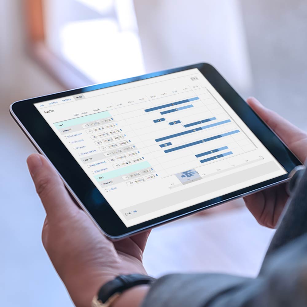 This option is one of the most popular among project management charts. A gantt chart serves as a roadmap to view specific goals and milestones in a calendar format, which makes tracking a project’s progress easy. Gantt charts are designed so that you can see how individual tasks contribute to a larger project. You’re able to see the expected timescale and how each task affects others. A gantt chart also enables you to keep field service projects on track. Below is an example of a gantt chart:
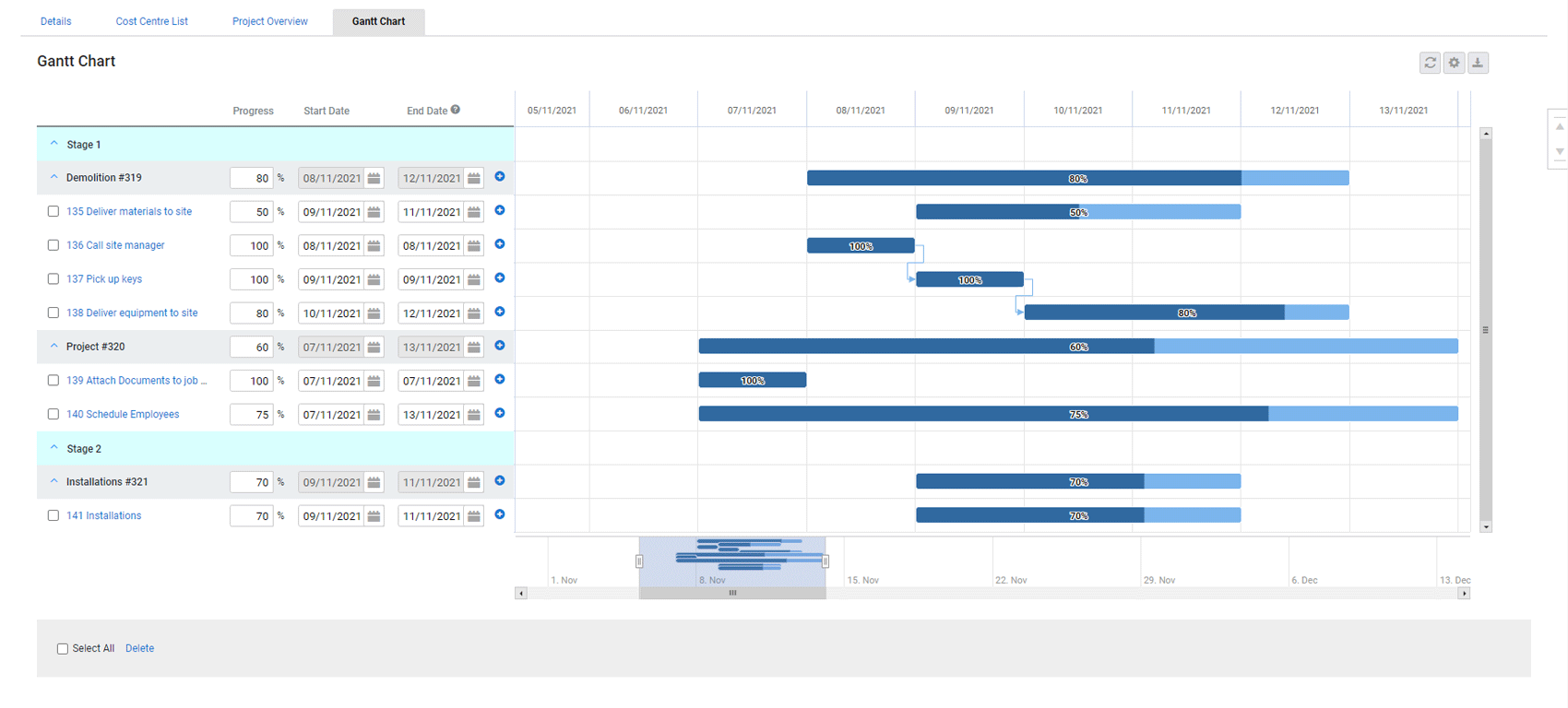
Gantt charts can be a little time consuming to set up–but once you’ve laid the groundwork, there’s a consistent set of information that shows what’s happening on a project and when. It also lets you manage how different team members are working alongside one another.
Flowchart
You may remember these from school, a work training course, or that old family tree that used to hang on your granny’s wall. Flowcharts tend to use rectangular boxes, but are not limited to those, to represent the steps needed to complete a project. As I demonstrated above, they are used in a variety of different ways. Much like the name suggests, there’s a flow in how you follow them and there are sometimes multiple options or routes to take. As a visual aid, flowcharts are a great form of communication among colleagues. They help outline processes. For example, a particular task that’s part of a larger project is displayed step-by-step on a flowchart helping visual learners see how the tasks work together. Unfortunately, this type of chart isn’t ideal for larger bodies of work or tasks that involve multiple departments. This is due to the fact that the information is represented with boxes and arrows leading into and away from certain outcomes. For large, multidepartment projects this will quickly become confusing.
Critical path diagram
A critical path diagram has to be exact to work effectively. Detailing all of the most important tasks in a project, it allows project managers to budget and set realistic deadlines throughout. Below is an example of a critical path diagram:
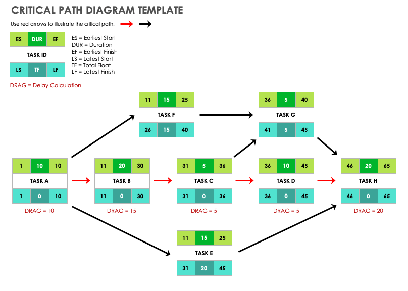
If you’re looking to break down a project into a simplified format, a critical path diagram is a great option because it allows you to gain further insight into the whole project by focusing on the important tasks. One of the downsides to this approach is that you need to be confident with your planning stages. If an essential task is missed from the diagram it can have a knock on effect later on. In addition, if you find yourself having to retrace your steps, the diagram may become too complex and unusable.
WBS diagram
A work-breakdown structure (WBS) diagram is similar in visual style to a flow chart. Formed of rectangular boxes it breaks down a project into levels. The end goal sits at the very top. Then, as you navigate down through the levels, additional tasks that contribute toward completion of the project are visible. A WBS diagram allows you to see a detailed overview of a larger scale project and any costs associated with it. The downside is that it doesn’t really work for seeing the timeline of a project and any dependencies in that area of a project.
PERT chart
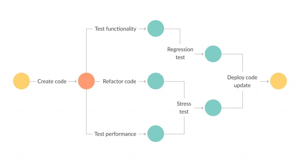
If you’ve got a project with a flexible time frame, a PERT chart may be one of the best options. A PERT chart will show a project’s tasks and any other involving factors connected to those tasks, it’s used as a way of estimating how long a project may take and that’s why it tends to be one of the more popular choices. PERT is an acronym for programme evaluation and review technique. You may have noticed that some of these diagrams have a lot of similarities in their visual styles even though they detail information differently. A PERT chart is no different. Reading horizontally with circles and arrows linked together, each piece of information represents milestones and activities contributing to one project. Below is an example of a PERT chart:
Bar chart
A bar chart is like the vanilla ice cream of the data visualization world–quite simplistic with no fancy bells and whistles. And that’s not to say vanilla ice cream isn’t delicious! You simply know what you’re getting and it’s exactly as it says on the tub. The Y axis (the vertical axis on the left or right side) measures one set of variables, for example the costs of a project. The X axis (the horizontal axis at the bottom) will measure another, for example the year a project was completed. For example, you could take a look at how much revenue was generated over a set period or the time taken to complete projects among set teams. The positives and negatives of this kind of chart are both one and the same. They’re simplistic and easy to create but on the other hand you can only look at one aspect of a project, so the simplicity of them could be a hindering factor when deciding which project management tools to use.
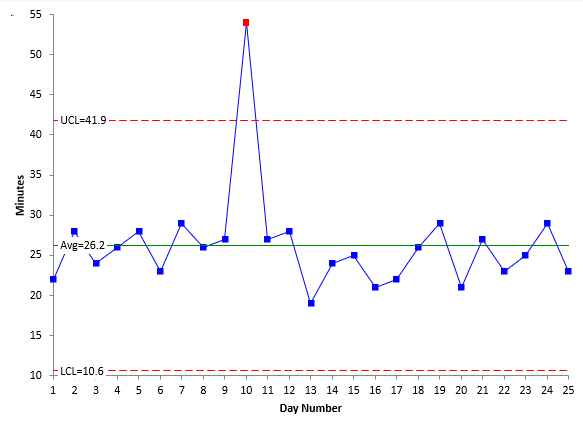
Control chart
A control chart represents a set process or task so you can see progress over time and any changes that have occurred along the way. Displayed in a line graph format with an X and Y axis, one of the distinguishing traits about a control chart is the upper and lower limit line on the graph. Provided everything is on track with the process or task, the standard middle line should sit between the lower and upper limits. If that isn’t the case then a project manager can step in and investigate what may be causing the unexpected behavior. This type of chart is fantastic for problem solving before a task goes completely haywire or has unexpected time and material delays. Conversely, it can create a “false alarm” effect. For example, there may be a task that commonly spikes or dips above and below the limits and because a control chart doesn’t show the cause of a variation, it can be hard to tell if the cause of it is an emergency. Below is an example of a control chart:
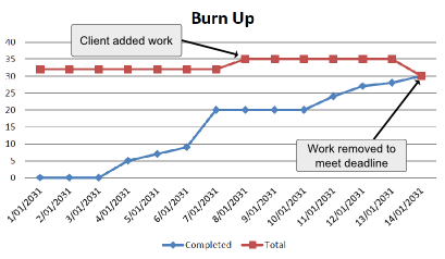
Burn-up or burn-down project charts
These two are either side of the same coin. A burn-up chart displays all of the project work that has been completed, whereas a burn-down chart displays any outstanding work. Visually, the data is displayed in line graph form, with an X and Y axis and both sets of data showing on the same graph. As this kind of information is used for a quick glance on project status, the downside is that it doesn’t include much detail in regards to which specific tasks that have been completed. On the plus side, you can view whether a project is due to finish on time and get a basic idea about what is still outstanding. Using this information a project manager can adjust plans and deadlines accordingly. Below is an example of a burn-up chart:
Which One is Best for you?
Whether you use gantt charts in project management, or you opt for a PERT chart or a bar graph, they each perform in different ways. Your business and your needs for monitoring the data will dictate which type of chart will work best. In some cases, you may even use a mixture of all of them!
How to Use Project Management Charts to Monitor Field Service Projects
 In the field service industry, project management charts can be used to visualize project progress, streamline communication and meet deadlines. By using these charts, businesses can become more accurate in forecasting the time needed to complete a project and receive increased clarity around project status. Let’s take a look at how they can impact field service projects.
Keep your projects on track
When you know the deadline for a project, you can set dates for the different project phases and even smaller tasks within the overall project to ensure you meet your final deadline. For example, a gantt chart shows the start and projected finish dates for tasks over a period of time so you can easily view how long each task will take.
View staff schedules
Gain a clear picture of what your individual staff or teams are working on in real time. Track labor hours for quick invoicing and timesheet updates. And, with a well-organized calendar view, easily communicate schedule changes with staff. Rather than stumbling through reams of paper trying to figure out who’s where and what needs finishing, a digital representation of this information can claw back hours of time.
Track and manage dependencies
Monitoring project dependencies is a vital part of making sure work happens in the right order and teams are scheduled at the right time. With a project monitoring chart, tracking and managing causal, resource based and cross team dependencies will be a lot smoother. With the ability to view information from one screen and catch any bottlenecks before they occur, you’ll see the benefits of adopting different styles of project monitoring charts in no time.
Review estimates and actuals
Another important part of project management is reviewing estimates and actuals. How much time do you think the project will take? Are you on track to meet your deadline? Does it look like you will run above or below your estimated labour hours? The way project management charts are laid out makes it easy to compare estimated timelines against actual progress in each phase or over the entire course of the project.
Easily communicate project progress with customers
To keep your customers happy and continue to grow your customer base, it’s vital to communicate project updates. Actively monitoring project progress in real time using a project management chart allows for you to proactively send status updates and other project information to stakeholders. Complete transparency with on-going projects helps build rapport and trust with customers.
Summary
With so many different charts and diagrams to choose from, sometimes it can be trial and error and there’ll be a teething process. However, with the right project progress charts at your disposal you can ensure future projects are performing as expected, streamline processes and gain further visibility into your business.